Root Cause Analysis
Description
Root Cause Analysis is an analytical report aimed at displaying the causes of degradation of the investigated service. Root causes are formed based on service metrics.
Cause Timeline
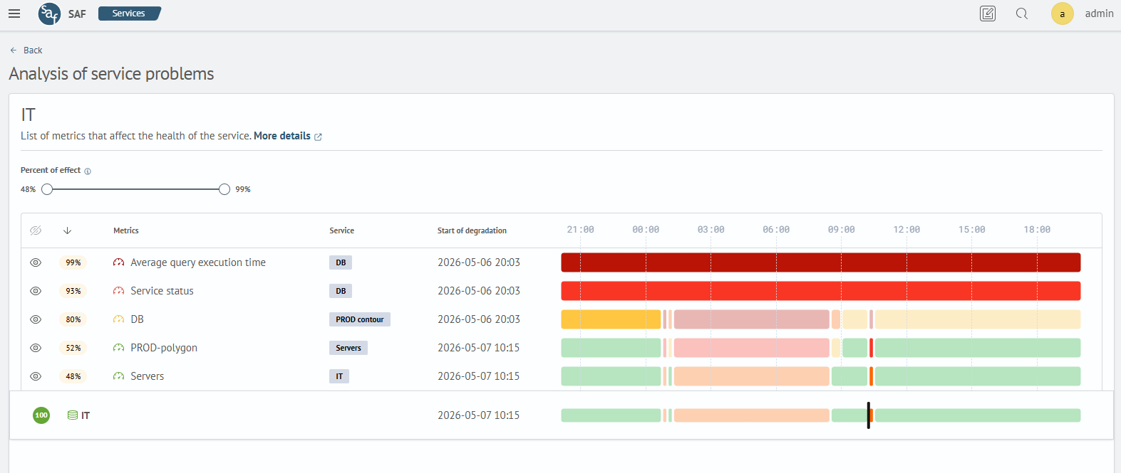
The Cause Timeline visualizes the list of metrics of the current service and all dependent services that were "unhealthy" during the analysis period. Each element in the table includes:
metric impact levelon the target service degradation;metricname;serviceto which the metric is bound;date and timeof the start of target service or metric degradation;timelineof health state changes over the selected period;- metric visibility control (hide/expand);
A metric will be included in the report if it was in an unhealthy state during the investigation period and the interval start is earlier than the start of the target service degradation.
The health level on the timeline is demonstrated by corresponding colors.
For the target service, the start of degradation is highlighted as a black vertical line.
The degradation interval of a metric or target service is highlighted on the timeline with a brighter color.
The start of target service degradation is the upper boundary when searching for a metric degradation interval.
The degradation interval is determined as follows:
- if there are healthy intervals, then the last healthy interval followed by unhealthy ones is selected. The degradation interval will be the one following the healthy interval
- if there are no healthy intervals, then the earliest unhealthy interval will be the degradation interval
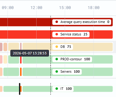
When hovering the mouse pointer over any interval segment, a tooltip appears showing health values for all entities at that time:
When hiding, the row with the metric moves to the bottom of the table.