Analytics Hub
General Purpose
The Analytics Hub is a starting point for monitoring and diagnosing services. It allows:
- Quickly assess the overall status of all services in the selected center;
- Filter problematic or unstable services;
- Go to in-depth analysis - health model or anomaly investigation.
When to use: daily monitoring, initial incident response, planned service status analysis.
Main Interface
The page consists of three logical blocks:
| Block | Purpose |
|---|---|
| Global Filters | Main center settings |
| Service Cards | List of services with their current status |
| Summary | Status dynamics of all services over time |
Global Filters

Here are the analysis boundaries set:
- Period (default - 24 hours) - determines the period for which the summary and trends are shown;
- Auto-refresh - data updates automatically;
- All Centers - return to the list of centers.
![]()
- Card filters by status - remove unnecessary items from the screen;
- Reset filter - return to displaying all services.
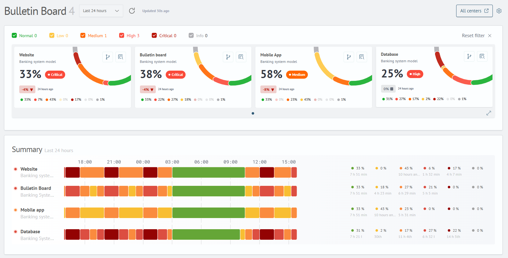
Service Card
Each card is the status of one service. It answers three questions:
- What service is it?
- Title - service identifier;
- Subtitle - model where the service is located.
- How healthy is it right now?
- Large percentage and color - integral assessment (0% = bad, 100% = excellent);
- Text status:
Normal/Risk/Warning/Critical/Faulty/Unknown.
- How has the status changed over the time period?
- Mini-trend: for example, "0% -> 100%" means the service recovered;
- Indication of each status in percentages.
In-depth Analysis
Each service card has three buttons in the upper right corner for detailed analysis:
| Button | Description |
|---|---|
| Health Model | Visual representation of the service status by metrics with color indication of problem areas and their impact on the overall assessment |
| Full Model Information | Detailed summary of all aspects of the model: list of services, their distribution by statuses for different time periods, list of connected metrics and links |
| Investigations | Tool for detailed analysis of the service status over time: time navigation, viewing metric charts, comparison with other services and transition to the resource map |
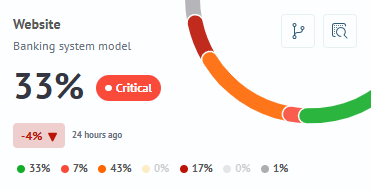
Summary - Status Chart Over Time
This is a historical snapshot of all services for the selected period.
For each service displays:
| Element | Example | Description |
|---|---|---|
| Service Name | Bulletin Board | Service name |
| Color Strips | Color row (green, yellow, red, gray) | Visual distribution of states over time |
| Percentages | 23% / 16% / 21% / 33% / 5% / 0% | Share of time in each status (Normal / Risk / Warning / Critical / Faulty / Unknown) |
| Duration | 5 h 32 m / 3 h 4 m / 5 h 6 m / 7 h 58 m / 1 h 11 m | Absolute time in each status |
How to use the summary - practical scenarios:
| If you see | This means | What to do |
|---|---|---|
| Simultaneous color change of several services | Incident affected a group | Look for a common cause (network, data source) |
| Single service "blinking" red/green | Instability | Look at high-resolution metrics in Investigations |
| Long red segment | Prolonged degradation | Alert should have already been sent, check in Health Model |
| Gray area | No data (Unknown) | Check metric source availability |