Pie Chart
Overview

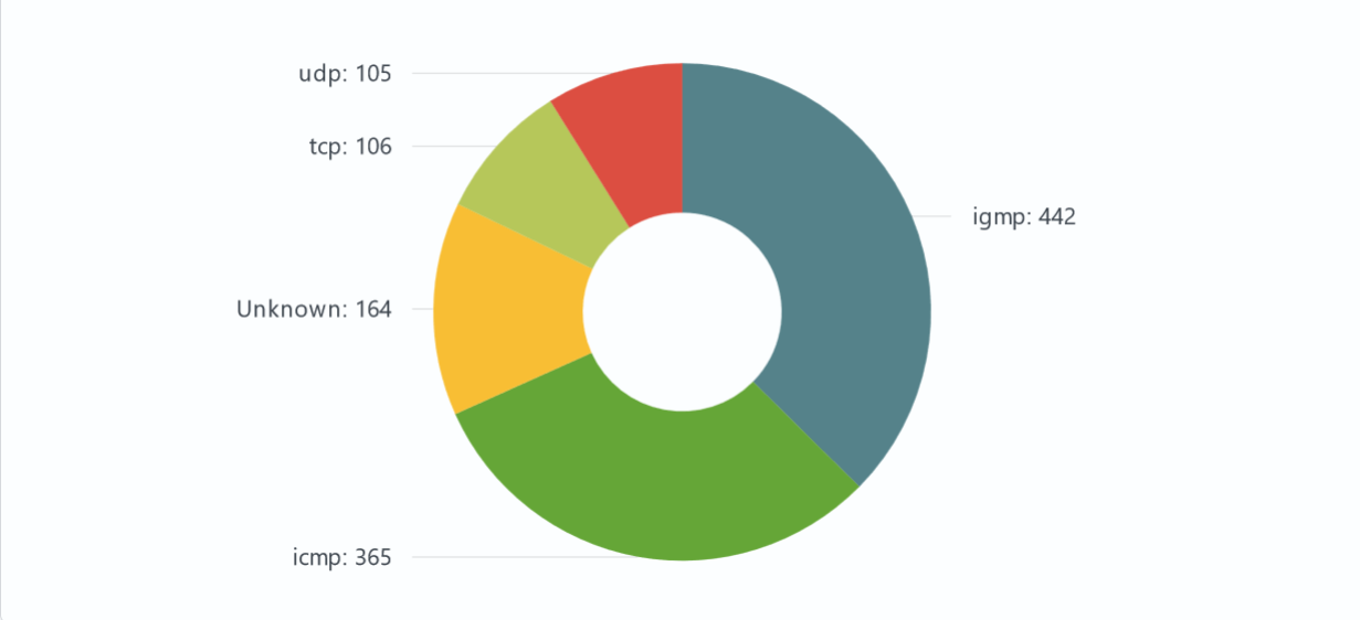
Pie Chart - A type of data visualization represented as a circle divided into sectors. Each sector represents a share or percentage of the total data. This type of chart is widely used to illustrate the relative shares of different categories in the total amount of data, allowing you to quickly visualize how the parts make up the whole.
Settings
General
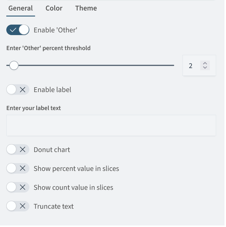
In the General tab, you can set the following parameters:
| Setting | Description | JSON-field |
|---|---|---|
Enable Other | A switch that groups data that is less than a specified threshold into a separate category | options.general.checkedOther |
Other percent threshold | A slider that specifies the percentage of the total data that defines the threshold of the Other section | options.general.threshold |
| Enable label | A switch that allows you to display the name of the pie chart specified in the Label text parameter | options.general.checkedLabel |
| Label text | Field for specifying the name of the pie chart | options.general.textField |
| Donut chart | A switch that changes the view of the diagram to the donut | options.general.checkedDonut |
| Show percent value in slices | A switch that allows you to enable or disable the percentage display of the ratio of each section | options.general.checkedSlicePercent |
| Show count value in slices | A switch that allows you to enable or disable the display of the real data quantity | options.general.checkedSliceCount |
| Truncate text | A switch that allows you to enable or disable text trimming, in case the text is too long | options.general.truncateText |
Search Anywhere Framework general settings window:

Color
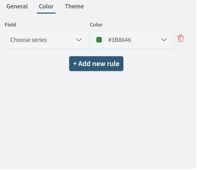
In the Color tab you can specify the color scheme for the pie chart. After clicking the Add new rule button, you can specify the desired Series and its Color.
The color setting has the following form:

Theme
In the Theme tab, you can select one of the prepared color scheme options. By default, the Smart Monitor theme is selected. The general list of themes is shown below:
- Smart Monitor
- Material
- Dataviz
- Kelly's
- Frozen
- Moonrise Kingdom
- Spirited Away
- Amcharts
Pie Chart creation
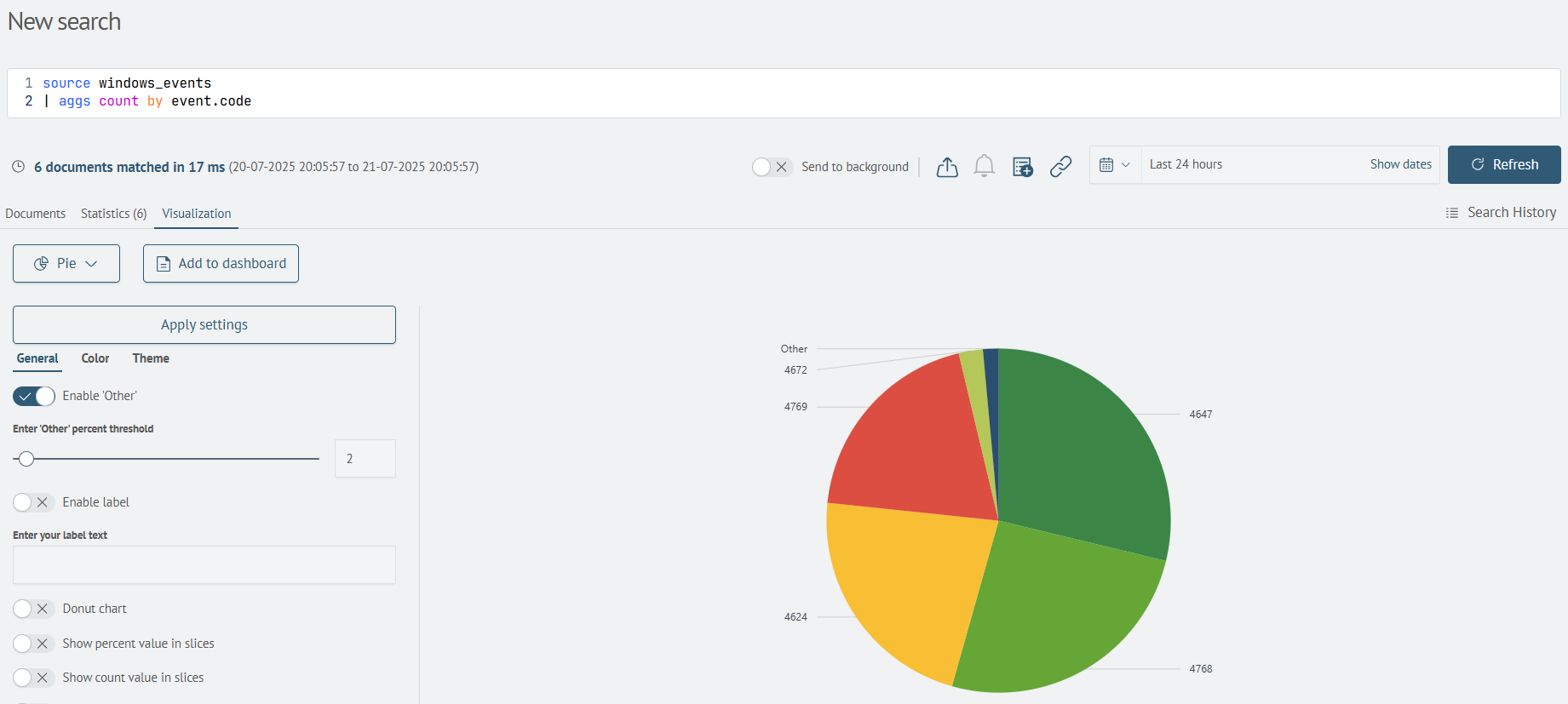
Creation of a pie chart is possible by applying statistical commands such as: stats, aggs and others. In this case, a table with the corresponding statistics will be returned.
For example, the query is:
source windows_events
| aggs count by event.code
Will return the following result:

After that, by going to the Visualization tab, you can select the Pie Chart visualization type and add it to the desired dashboard by clicking the Add to dashboard button.
