Line Chart
Overview
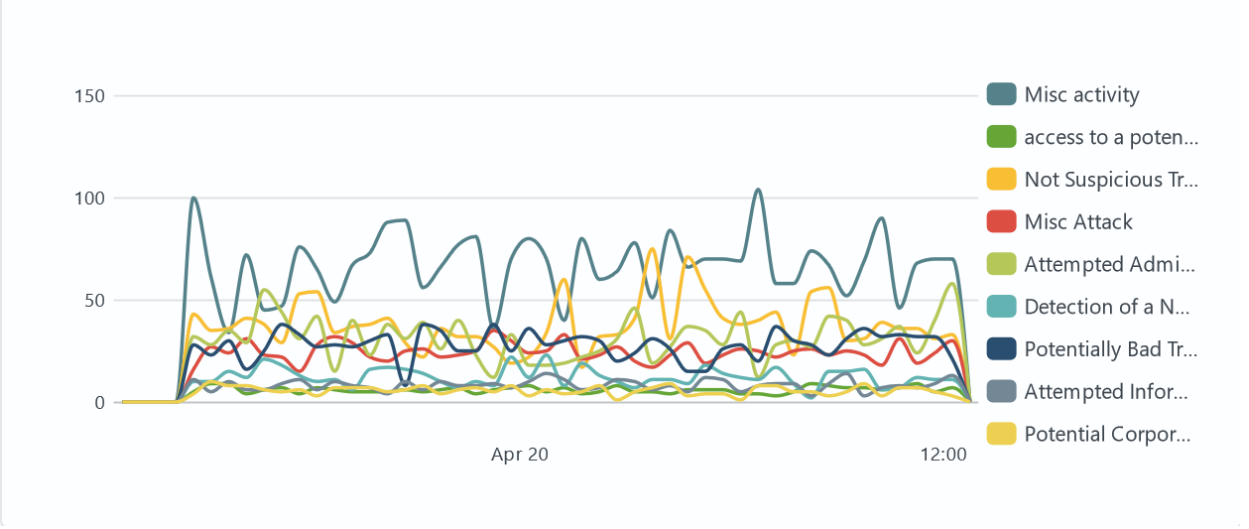
Line Chart is a type of data visualization that is widely used to show changes in the value of a variable over time or in relation to another variable. This graphical method allows you to visualize trends or changes in data because it is based on connecting points on a chart with lines. Such charts are commonly used to analyze time series, trends, and indicators, emphasizing the direction and magnitude of change. The advantage of line charts is their ability to show not only the change in value itself, but also the rate of change, making them an important tool for identifying trends and patterns in data.
Settings
General
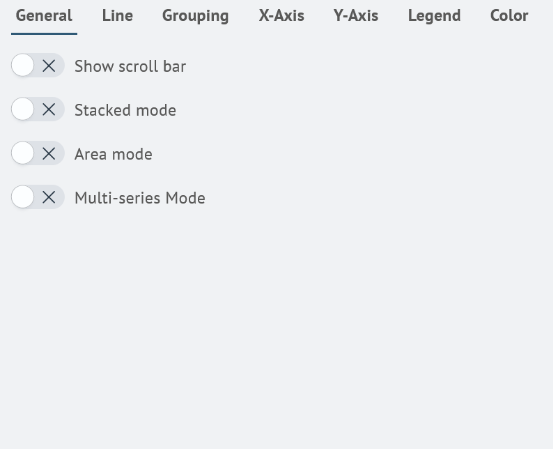
In the General tab, you can set the following parameters:
| Setting | Description | JSON-field |
|---|---|---|
| Show scroll bar | A switch to enable or disable the display of an overview scale of the entire visualization, allowing you to select a specific section of the visualization for detailed viewing. | general.showScrollBar |
| Stacked mode | A switch to enable or disable grouping of data series in a line chart. | general.stackedMode |
| Area mode | A switch to enable or disable shading of the area under the graph. | general.enableArea |
| Multi-series Mode | A switch to enable or disable splitting the chart into series. | general.multiSeries |
Search Anywhere Framework general settings window:
Line
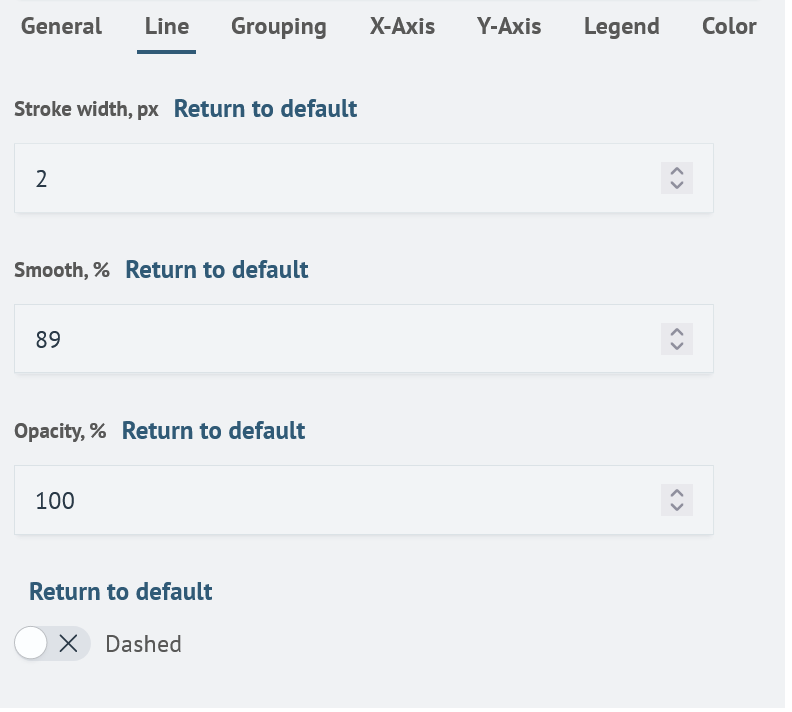
In the Line tab, you can set the following parameters:
| Setting | Description | JSON-field |
|---|---|---|
| Stroke width | A text field that allows you to set the line thickness in pixels. The default is 2px. | line.strokeWidth |
| Smooth | A text field that allows you to specify the amount of line rounding in percent. The greater the amount, the smoother the line will be. The default value is 89%. | line.smooth |
| Opacity | A text field that allows you to set the line transparency in percent. The smaller it is, the more transparent the line will be. The default value is 100%. | line.opacity |
| Dashed | A switch to enable or disable the dashed line view. | line.isDashed |
Search Anywhere Framework line settings window:
Grouping
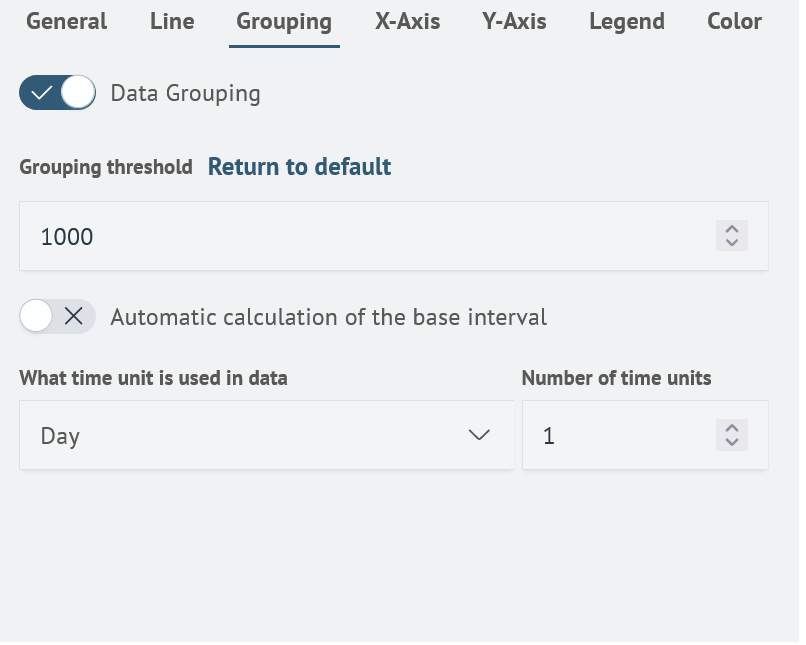
In the Grouping tab, you can set the following parameters:
| Setting | Description | JSON-field |
|---|---|---|
| Data Grouping | A switch to enable or disable data grouping. The default setting is off. | grouping.dataGrouping |
| Grouping threshold | A text field that allows you to specify the threshold value at which data grouping will occur. Default is 1000. | grouping.dataGroupingInterval |
| Automatic calculation of the base interval | A switch to enable or disable automatic calculation of the base interval. The default setting is on. | grouping.dataGroupingAutoBaseInterval |
| Time unit | Selection to specify the unit of time used in the data. Not active in automatic calculation. | grouping.dataGroupingAutoBaseInterval.timeUnit |
| Number of time units | Number field to set the number of time units. Not active in automatic calculation. | grouping.dataGroupingAutoBaseInterval.count |
Search Anywhere Framework grouping settings window:
Data grouping allows you to combine elements into larger groups when a certain number of intervals is reached. This reduces the number of points on the graph, making it easier to see. As you zoom in on the graph, these points become more detailed, showing more accurate values.
Grouping is activated when the number of intervals in the current area exceeds the specified threshold. By default, this threshold is set to 1000.
For example, if you disable automatic grouping and set the time unit to one day with a count of 1, when you get 10 years of data, grouping will be applied because the number of intervals (365 days * 10 years = 3650) exceeds the threshold. This allows the data to be visualized in a more compact way, making it easier to analyze and interpret.
Calculation of the base interval without automatic calculation provides the ability to more finely customize the intervals that are displayed on the graph. This allows the user more flexibility in controlling data visualization.
For example, if it is desired to group data by month, it is necessary to disable Automatic calculation of the base interval and set the time unit as "month" with the number 1. This will allow the system to display data grouped by month, which can be useful for analyzing data spread over months.
X-Axis
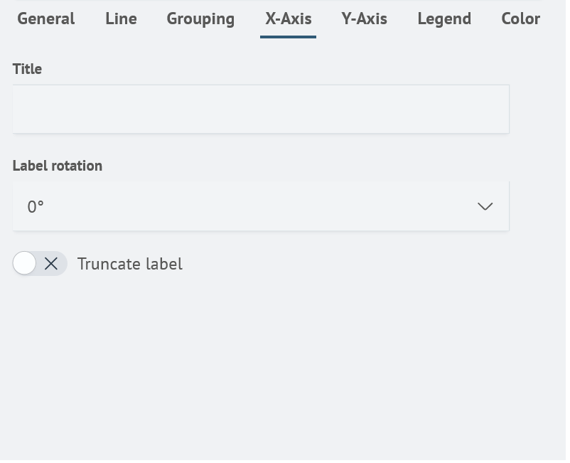
In the X-Axis tab, you can set the following parameters:
| Setting | Description | JSON-field |
|---|---|---|
| Title | Text field that allows you to specify the name of the X-Axis. | xaxis.title |
| Label rotation | Selection to set the rotation of the X-Axis name. Useful if the X-axis name is too long. | xaxis.labelRotation |
| Truncate label | A switch that allows you to enable or disable the truncation of the X-Axis name. Useful if the X-Axis name is too long. | xaxis.truncate |
Search Anywhere Framework X-Axis settings window:
Y-Axis
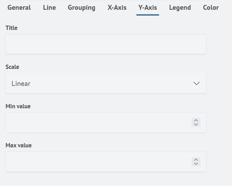
In the Y-Axis tab, you can set the following parameters:
| Setting | Description | JSON-field |
|---|---|---|
| Title | A text field that allows you to specify the name of the Y-Axis. | yaxis.title |
| Scale | Selection to set the display of the Y-Axis. The available values are: Linear and Logarithmic. | yaxis.logarithmic |
| Min value | A number field that allows you to specify the minimum value of the Y-Axis. | yaxis.minVal |
| Max value | A number field that allows you to specify the maximum value of the Y-Axis. | yaxis.maxVal |
Search Anywhere Framework Y-Axis settings window:
Legend
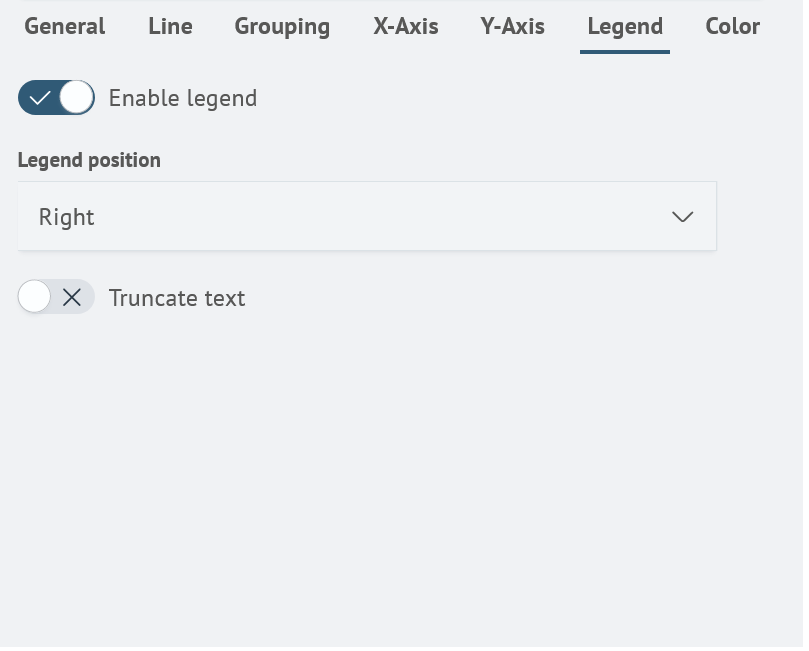
In the Legend tab, you can set the following parameters:
| Setting | Description | JSON-field |
|---|---|---|
| Enable legend | A switch to enable or disable the legend display. | legend.enabled |
| Legend position | A seletion that allows you to specify the location of the legend. Available values: Left, Right, Bottom and Top. | legend.position |
| Truncate text | Switch to enable or disable legend text truncating. | legend.truncateText |
Search Anywhere Framework legend settings window:
Color
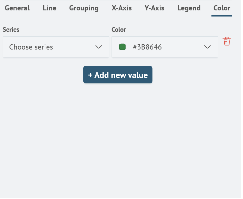
The Color tab contains settings of the chart color scheme. You can set a different color for each series of the chart. To do this, press the Add new value button, then specify the parameters for the series.
| Setting | Description | JSON-field |
|---|---|---|
| Series | Data series to be assigned a color. | color.colorList.field |
| Color | Color selection. | color.colorList.color |
Search Anywhere Framework color settings window:
Line Chart creation
Creating a line chart is possible by using commands that return data series in a query, such as timeaggs and timechart.
For example, the query is:
source windows_events
| timeaggs span=1h count(event.code) by user.name
Returns the result in the Visualization tab with a line chart:
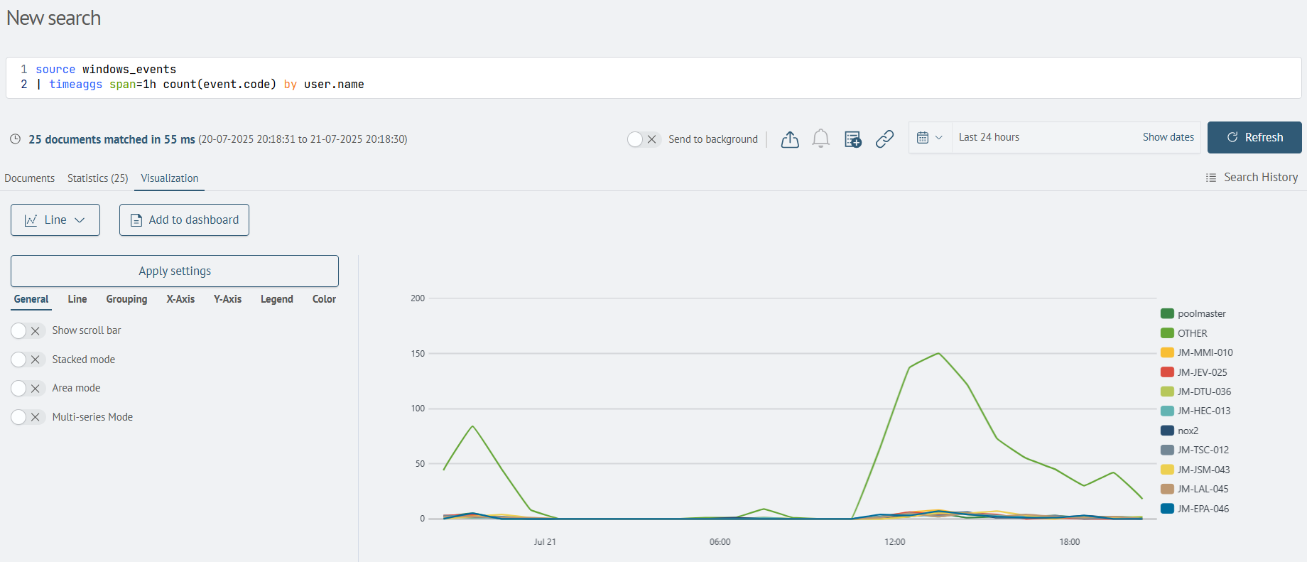
The visualization can then be saved to the dashboard by clicking the Add to dashboard button.