Create Visualization
Create Visualization within Dashboard Edit Mode
Panel creation requires creating a dashboard. To do this, navigate to Main Menu - Dashboards. Click the New dashboard button. The following dashboard parameters are provided as an example:
Title: Windows EventsSystem ID: win-events
For creating a visualization panel inside a dashboard, switch to dashboard editing mode by clicking the Edit button in the top right corner and click the Add Panel button.
For comprehensive details on dashboard construction, field definitions, and naming conventions, please visit.
The dropdown menu allows for pre-selecting the desired visualization type when the button is clicked:
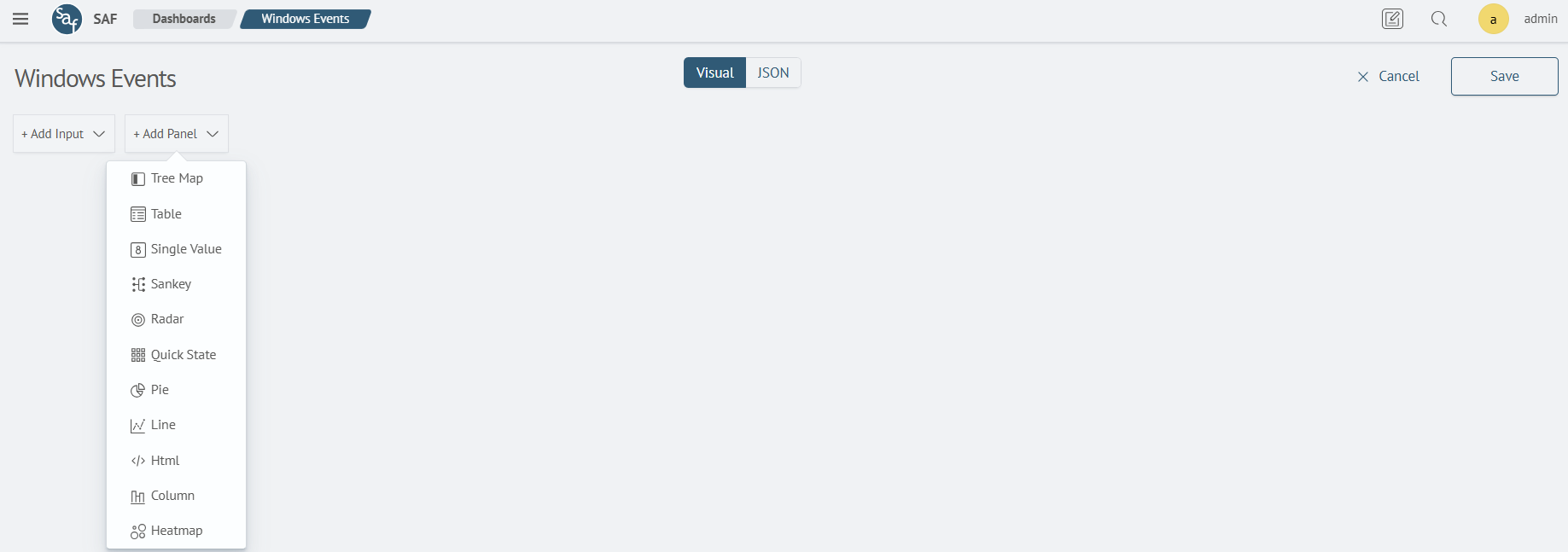
Choose a Single Value Visualization.
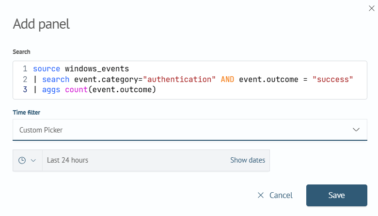
Upon selecting the visualization type, a modal window will appear to add a new visualization to the dashboard. This modal window includes the following fields:
Search– Search Anywhere Framework Language (SAFL) queryTime filter– Time range for the query
An example of this is a query that returns the number of successful logins:
source windows_events
| search event.category="authentication" AND event.outcome = "success"
| aggs count(event.outcome)
The panel displayed but remained empty.

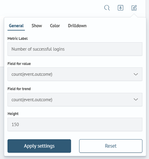
To resolve this issue, access the visualization settings and configure the following parameters within the General section:
Metric Label: Number of successful loginsField for value: count(event.outcome)Field for trend: count(event.outcome)
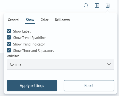
Within the Show section, set
- Show Label
- Show Trend Sparkline
- Show Trend Indicator
To apply the changes, click the Apply Settings button and then exit dashboard edit mode by clicking Save. As a result, a visualization will appear on the dashboard displaying the number of successful logins:

Create Visualization within Search Visualization Menu
Panels can also be created directly from the Search Anywhere Framework Search. To achieve this, follow Main Menu - Search:
For search, utilize the same query as when creating via dashboard edit mode:
source windows_events
| search event.category="authentication" AND event.outcome = "success"
| aggs count(event.outcome)

Click the Refresh button. The Statistics tab will immediately appear, displaying a table with a single column named count(event.outcome).

Navigate to the adjacent Visualization tab. The following interface will appear:
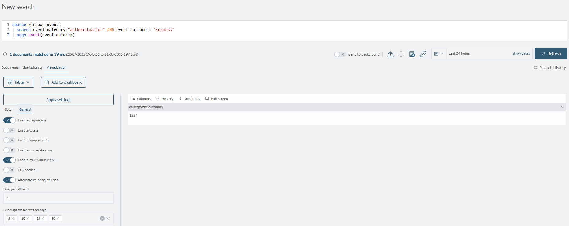
In this section, pre-configure visualization parameters prior to adding or creating them on the dashboard. To begin, replace the Table option with Single Value in the visualization type dropdown-menu.
Within the General section of the settings below, specify the following parameters:
Metric Label: Number of successful loginsField for value: count(event.outcome)Field for trend: count(event.outcome)

Within the Show section, set
- Show Label
- Show Trend Sparkline
- Show Trend Indicator
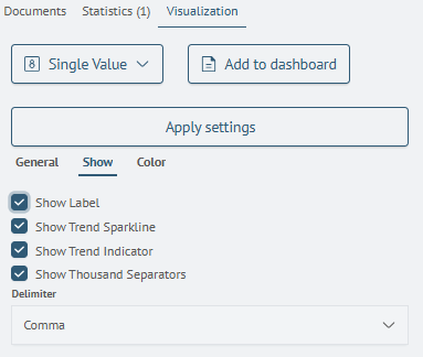
Apply the configurations by clicking the Apply settings button. The implemented modifications will be reflected in the right-hand section of the editor.

Proceed by clicking the Add to dashboard button. A modal will appear, prompting you to select the dashboard to which you want to add the newly created panel:
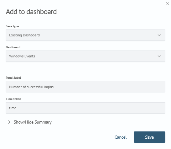
Specify the parameters for the previously created dashboard:
Save type: Existing DashboardDashboard: Windows EventsPanel label: Number of successful logins
The remaining fields can be left blank. Click the Save button.
A message will appear indicating successful panel saving and prompting you to navigate to the dashboard containing the newly created panel:

Clicking the View dashboard button will redirect you to the dashboard page containing the newly created panel:
