 | Table is a type of data visualization presented as an ordered collection of rows and columns. Each row in a table represents a separate record or data element, while each column represents a specific attribute or characteristic of these records. |
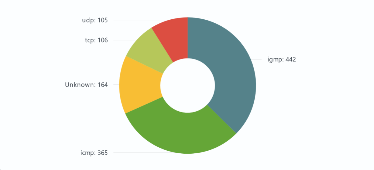
 | Pie Chart is a type of data visualization that represents data as a circular graph divided into slices. Each slice represents a portion or percentage of the whole. Pie charts are often used to illustrate the relative proportions of different categories within a dataset. They provide a quick way to visualize how parts make up a whole. |
 | Single Value visualization is a data representation tool that focuses on displaying and highlighting a single numerical value or metric. This type of visualization is commonly used to clearly present a specific metric or key performance indicator (KPI). |
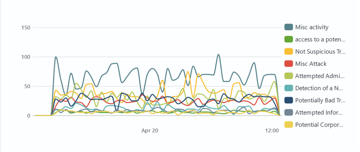
 | Line Chart is a data visualization technique used to depict the change in a variable's value over time or in relation to another variable. Line charts are created by connecting data points on a graph with a line, providing a visual representation of the trend or changes in the data. |
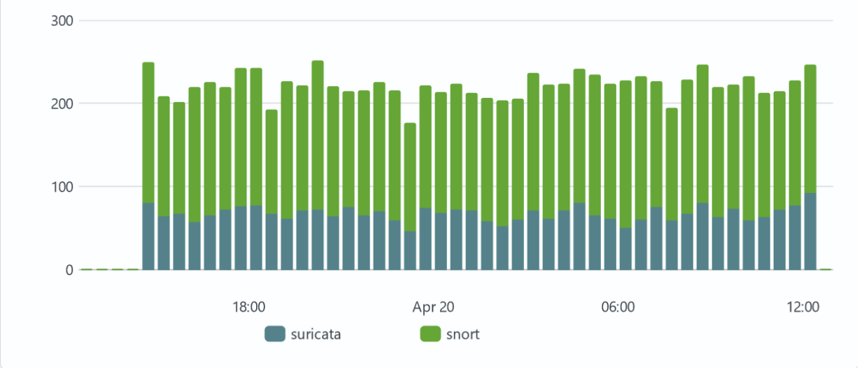
 | Column Chart is a data visualization technique that represents information using rectangular columns of varying heights. Each column corresponds to a distinct category or group of data, and its height is proportional to the quantity or values within that category. Column charts are commonly used to compare the relative magnitudes of different categories. |
 | HTML-based Data Visualization is a data representation technique that utilizes HTML markup to structure and present information. HTML code can be written in an editor, incorporating tokens to dynamically access data, while CSS can be used in a separate style editor to style the layout. |
 | Heatmap is a data visualization technique that represents information using rectangular areas of varying colors. Each area corresponds to a distinct category, and its color encodes a quantitative value within that category. Heatmap are commonly used to illustrate the magnitude of quantitative measures across different categories using color. |
 | Sankey – a type of data visualization where information is represented as objects (nodes) connected by lines of varying width. Sankey diagrams are commonly used to illustrate business processes, showing key steps and the flow intensity between them. |
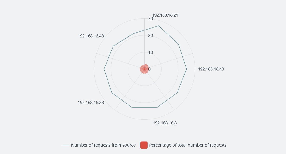
 | Radar Chart– a type of data visualization presented as a chart with two dimensions, where one or more groups of values are displayed along radial axes. This format is often used to compare multiple items across several variables simultaneously. |
 | Tree Map is a type of visualization that displays data as a set of rectangles, with the area of each rectangle being proportional to the numerical value of the corresponding category. |
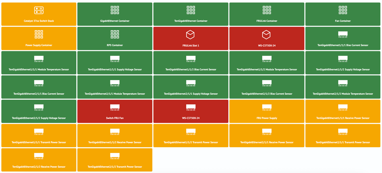
 | Quick State is a type of data visualization represented as a group of cards displaying the state of objects. The visualization parameters (label, color, and icon) are determined based on values from the search query results. |
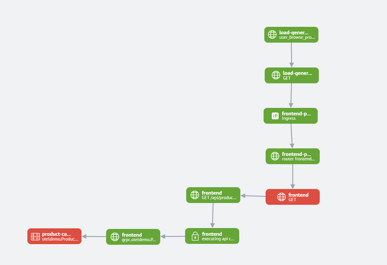
 | Map Visualization - a visualization type that displays data as nodes (vertices) and their interconnections (edges), representing complex categorical relationships in a structured format. |
 | Trace Timeline - is a visualization type that displays operation execution time intervals (traces) as a Gantt chart. It enables analysis of duration, sequence, and parallelism of processes in distributed systems. |

