Navigation Settings
Overview
Navigation settings are used to define sections, dashboards, and pages in the system's main navigation menu.
Configuration
The navigation menu configuration page consists of two main parts:
- Navigation Menu Settings - tools for editing the menu
- Preview - a preview of the navigation menu reflecting the latest changes
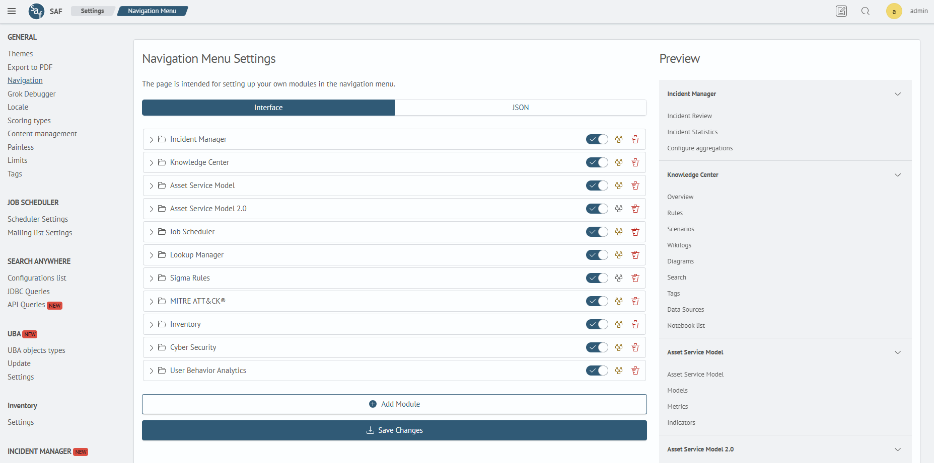
There are two ways to configure the menu:
- Interface - editing the menu using a tree structure of elements
- JSON - editing the menu via a JSON editor
You can switch between modes using the toggle:
Graphical Interface
The graphical interface presents the navigation menu as a tree structure consisting of:
- Group - a container that includes multiple menu items
- Dashboard - a link to a dashboard
- Page - a link to a module page
You can add a new item using the Add Module or Add Section buttons. The new item will be appended to the end of the tree. By default, all elements in the tree are collapsed — click on them to expand.
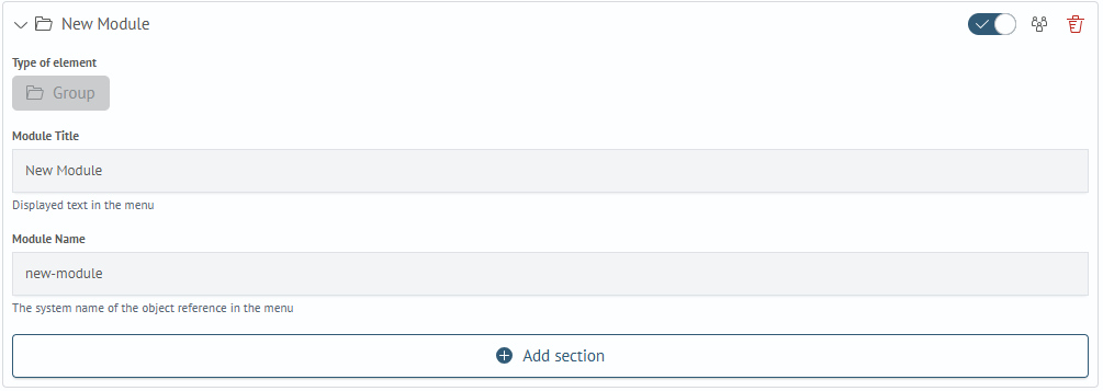
Within each item, you can define:
- Module Title - the label displayed in the main menu
- Module Name - the internal identifier used by the system
Root elements of the tree are always modules, represented by Group items.
New elements can be added using the Add Section button. Each menu item comes with a set of control functions located next to its name:
These include:
- Visibility toggle - controls whether the item is shown in the menu
- Permissions - opens the permission editing interface
- Delete - removes the menu item
Menu items can be reordered within their parent group to change their order in the menu.
Group
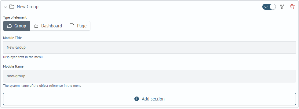
The Group type is used to group menu items.
Page
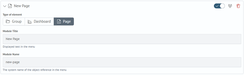
The Page type is used to create a link to a module page. This item does not support nesting.
Dashboard
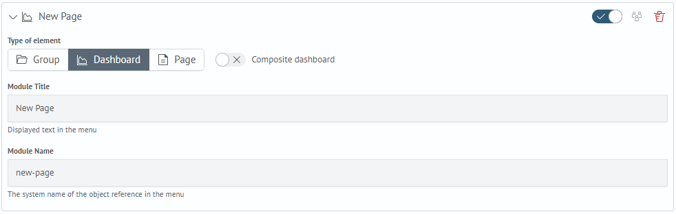
The Dashboard item is used to create a link to an existing dashboard. This item supports two modes, toggled via the Composite dashboard switch. A regular dashboard item does not support nesting. If the dashboard is marked as composite, it can include other Dashboard and Group items. The system name of a composite dashboard can be set to any value.
When navigating to a composite dashboard from the menu, the system will open a page with tabs, each representing an embedded dashboard.
Dashboards that are part of a composite dashboard cannot have nested items. Additionally, groups can only contain regular dashboards.
Permissions
You can define permissions for each menu item. To do so, click the people () icon next to the desired menu item. This will open a modal window where you can configure access.
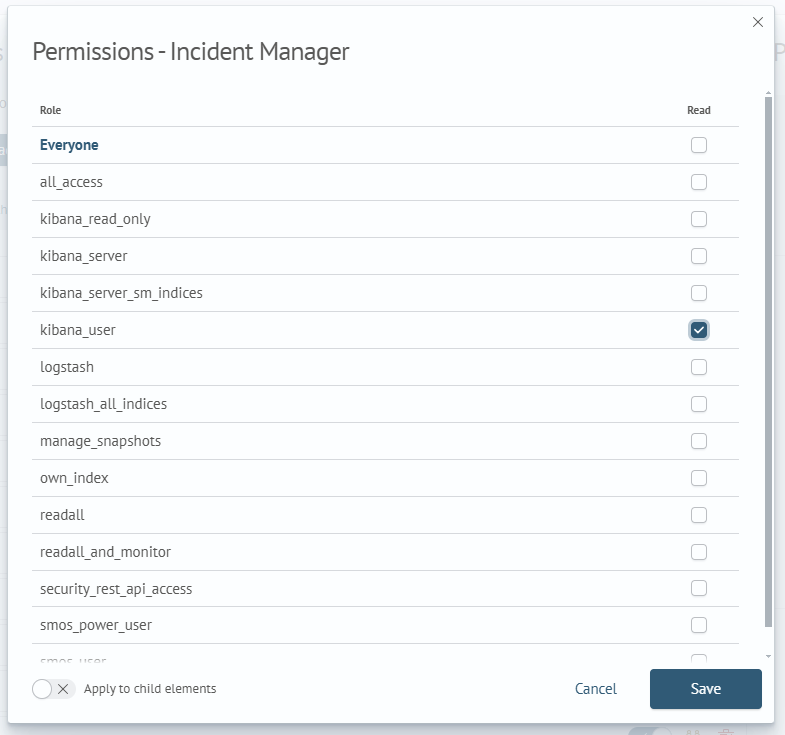
At the bottom of the modal, there is an Apply to child elements toggle. Enable this to apply the same permissions to all nested items of the current menu entry.
All newly created menu items already have a permissions object. Items without permissions are marked with a people () icon highlighted in yellow, and access will be granted to all users.
Exceptions
Permissions for some modules are configured separately.
SAF Beat Manager
For information about access control for the SAF Beat Manager section, see Installing SAF Beat Manager.
Security Settings
Access to security settings is controlled by the following cluster permissions:
cluster:admin/opensearch/securityconfig/*- full access to security configurationcluster:admin/opensearch/securityconfig/update- update security configurationcluster:admin/opensearch/securityconfig/get- view security configuration